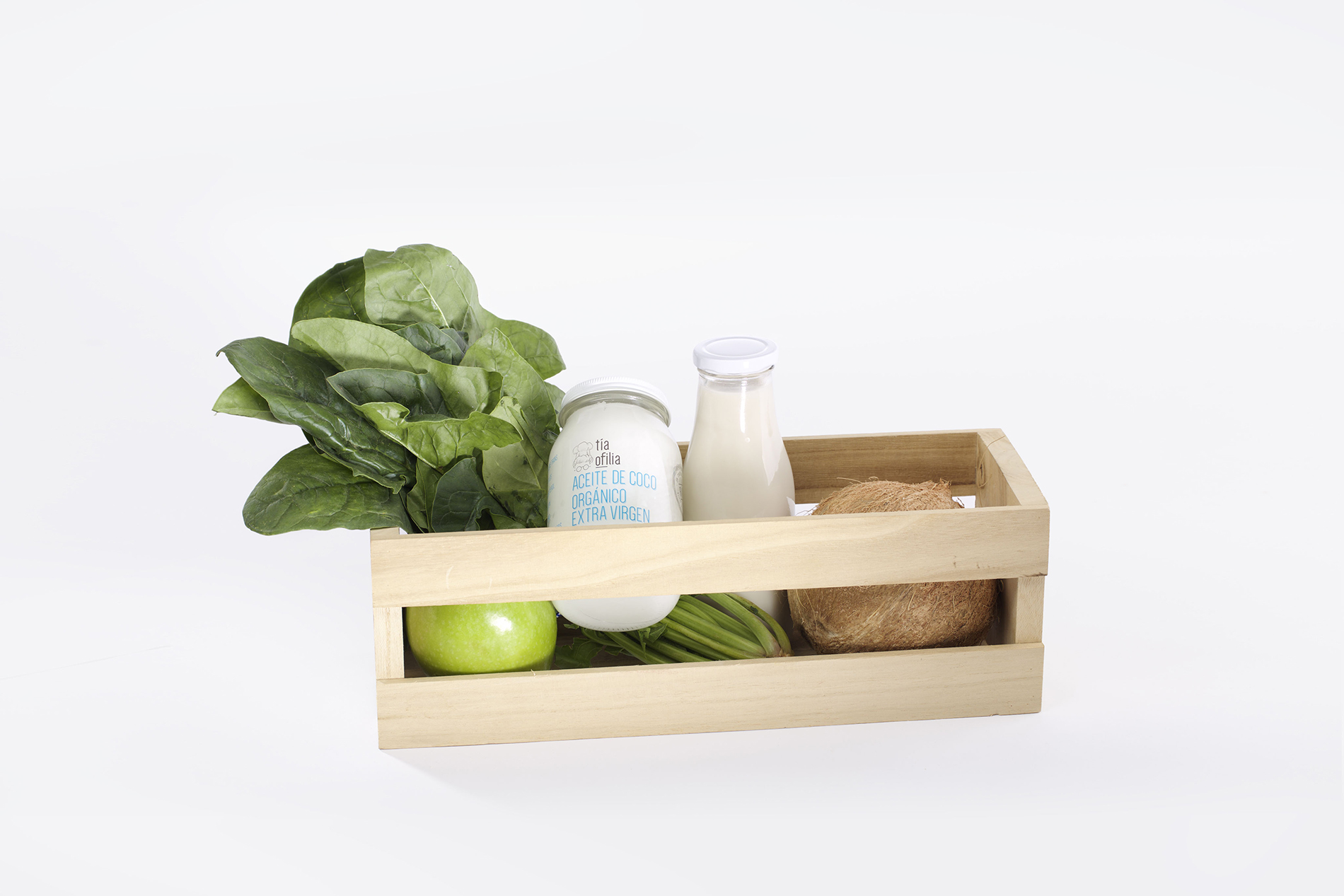
Tia Ofilia (Aunt Ofilia) is an organic foods brand from Monterrey, Mexico focused on delivering healthy natural and raw nutriments with a warm familiar taste.
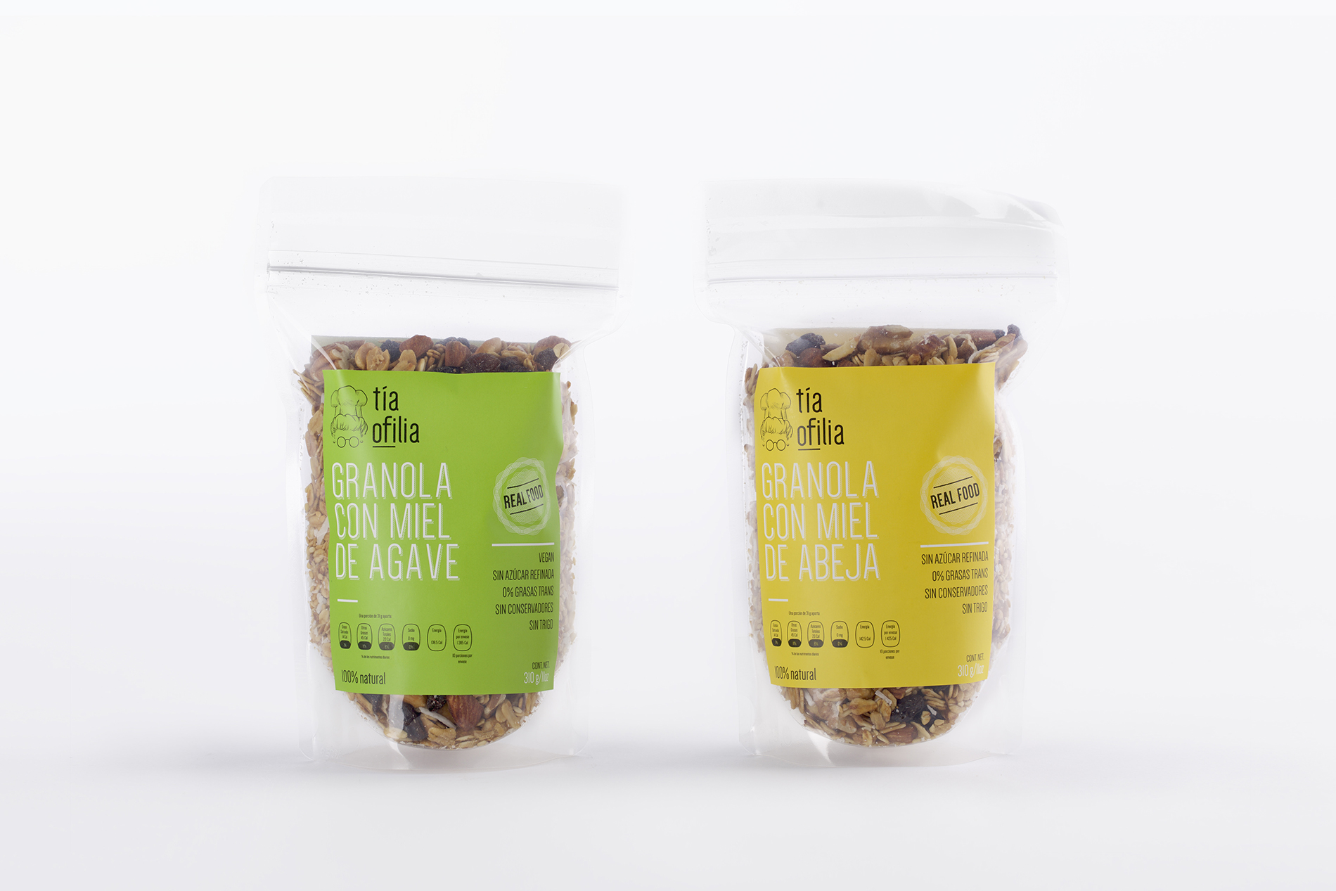
Tia Ofilia first approached us with the intention of formalizing its brand, seeking to expand their product range beyond their popular Granola mixes. Our analysis culminated in a re-brand process that would enable Tia Ofilia to properly and effectively communicate their vision, creating a unified brand experience and language for all future products and customer touch points.
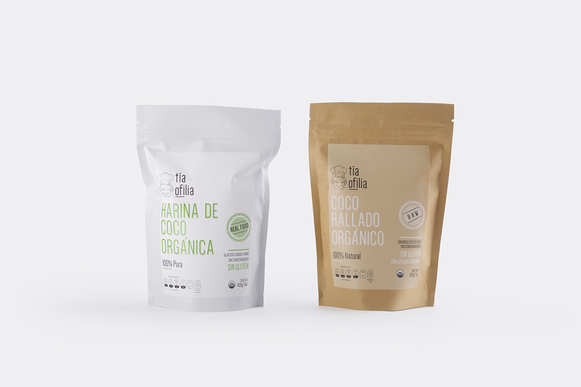
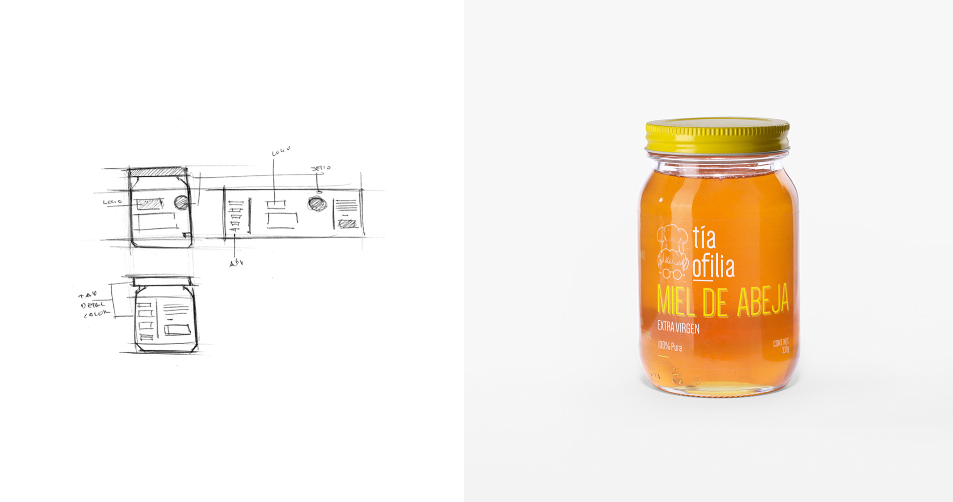
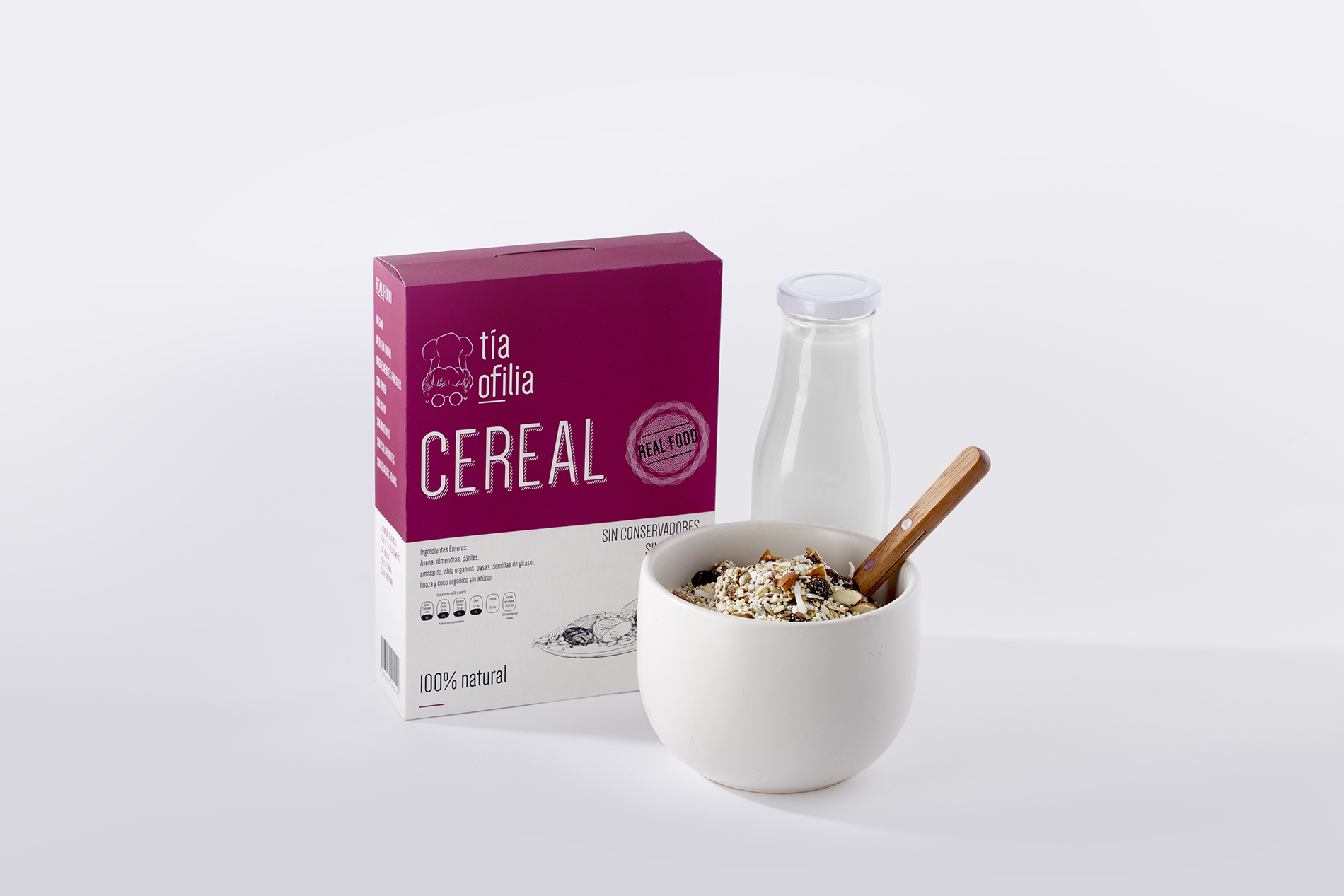
We focused primarily on generating a sense of purity, honesty and familiarity to highlight the company’s mission towards creating a more natural world.
Tia Ofilia’s original logotype consisted on a cartoon styled illustration of Tia Ofilia herself. In order to generate a more modern, genuine and gentle image, we produced an illustration of Tia Ofilia. Using delicate hand made strokes, we were able to provide a slightly more somber tone, conveying the brand’s determination towards fostering a healthier lifestyle.
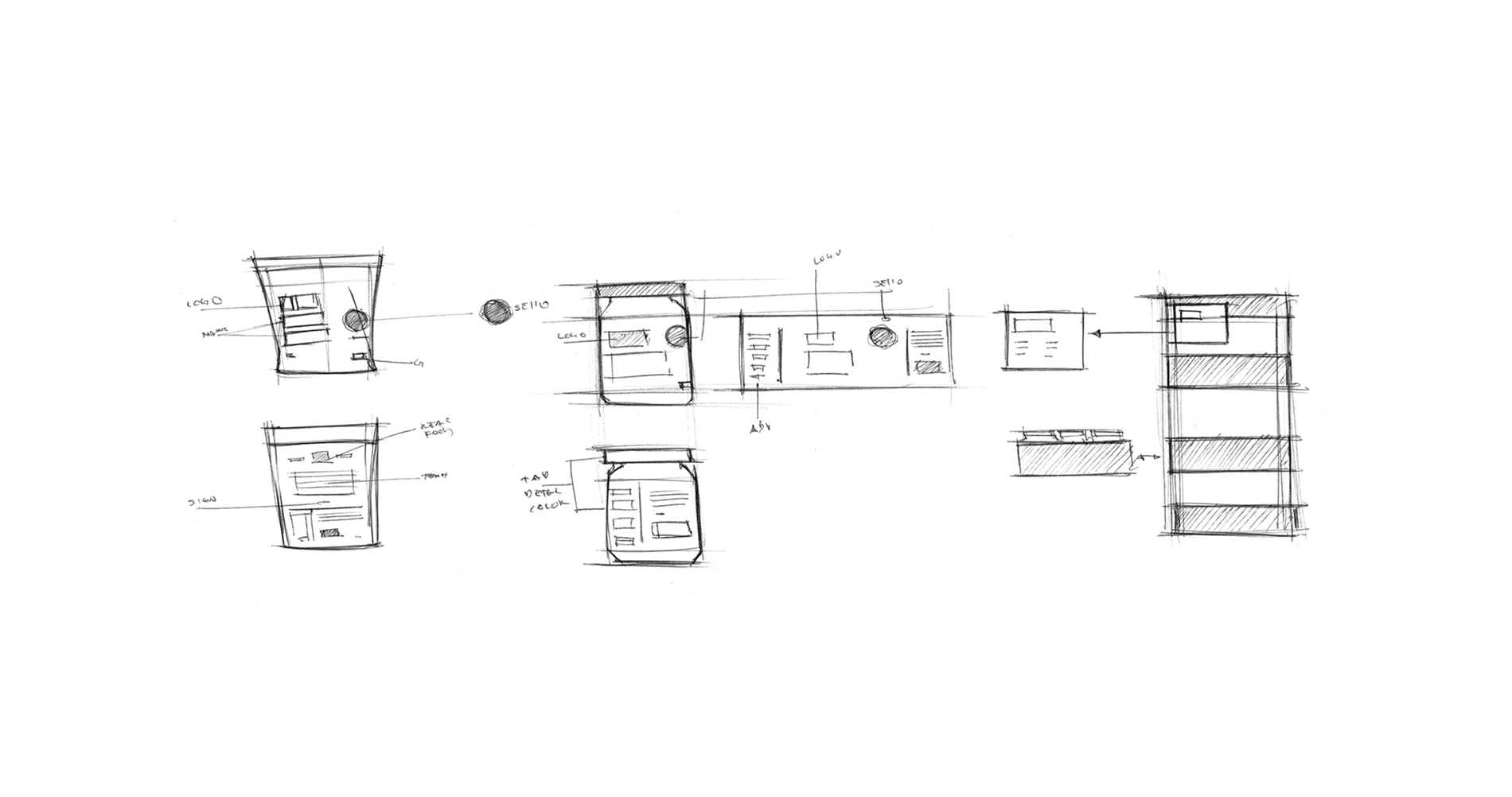
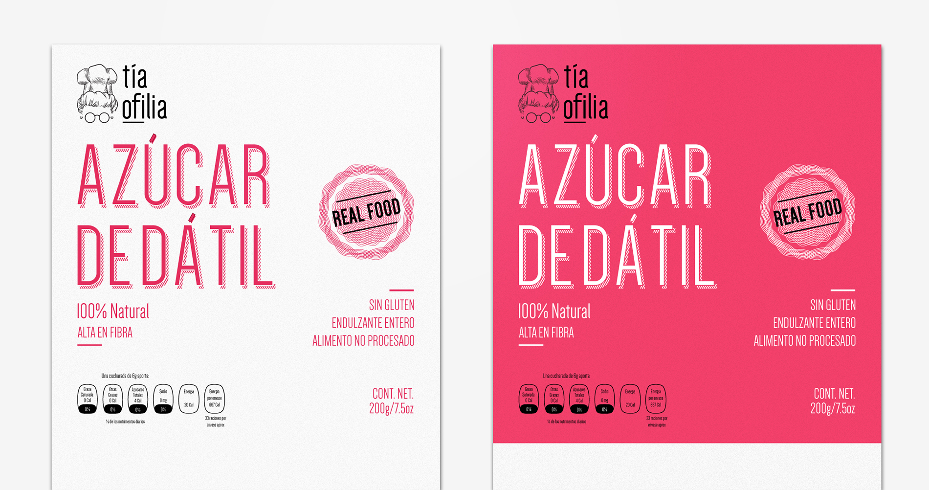
To unify the brands modern simplicity with its hearty origin and strong sense of tradition, we developed a custom typeface based of a simple lean sans serif adding graphic interventions to convey the passion and effort behind every product.A “Real Food” seal was developed to emphasize the brands commitment to generating genuinely natural and organic foods in an increasingly artificial industry.
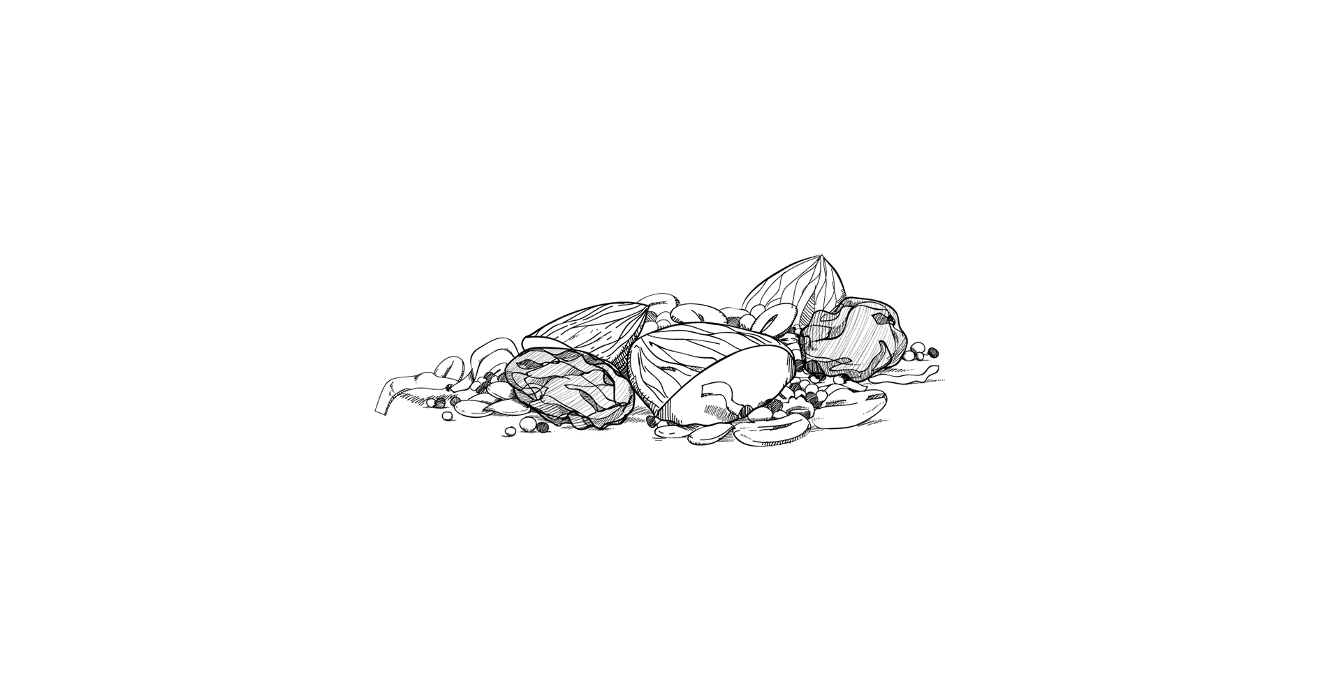
An overall clean and pure tone is complemented by simple yet delicate hand made illustrations, a nod to the loving dedication and tradition behind Tia Ofilia’s foods.


